


Corum is a brand that I can never quite grasp or understand, and I’m convinced that this is why I’m perpetually drawn to, and intrigued by, their watches. Probably best known for the Admiral’s Cup and Bubble references, Corum has an interestingly varied history and catalogue; the brand has done whatever it’s wanted, whenever it’s wanted, and has produced some of the more out there watches of the last half century.
Like 90s Tag Heuer, Cartier of any era, and most recently the gold and more jewelry-leaning pieces of Piaget, I think the time is ripe for Corum to have a moment. I’m not talking from a buy/sell value standpoint, but rather from an enthusiast, appreciative perspective. Specifically, I believe that Corum’s work with gold is criminally under appreciated, and with gold watches getting to be a bit more popular again, I think Corum is worth at least a moment of your time.

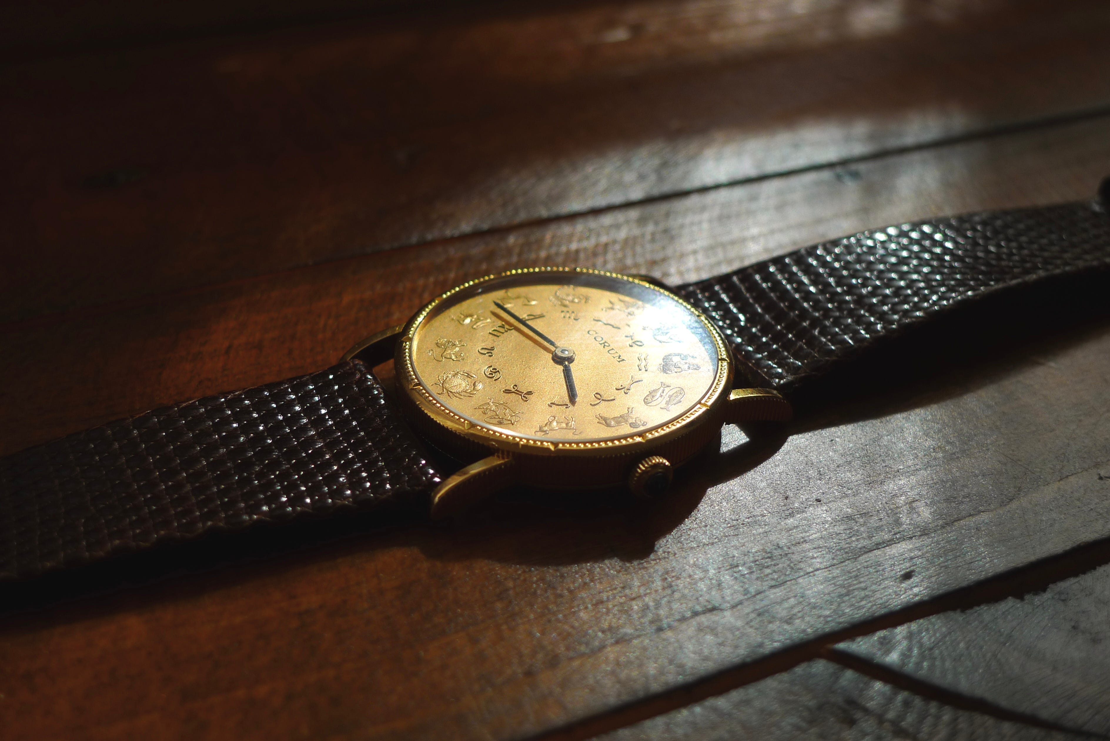
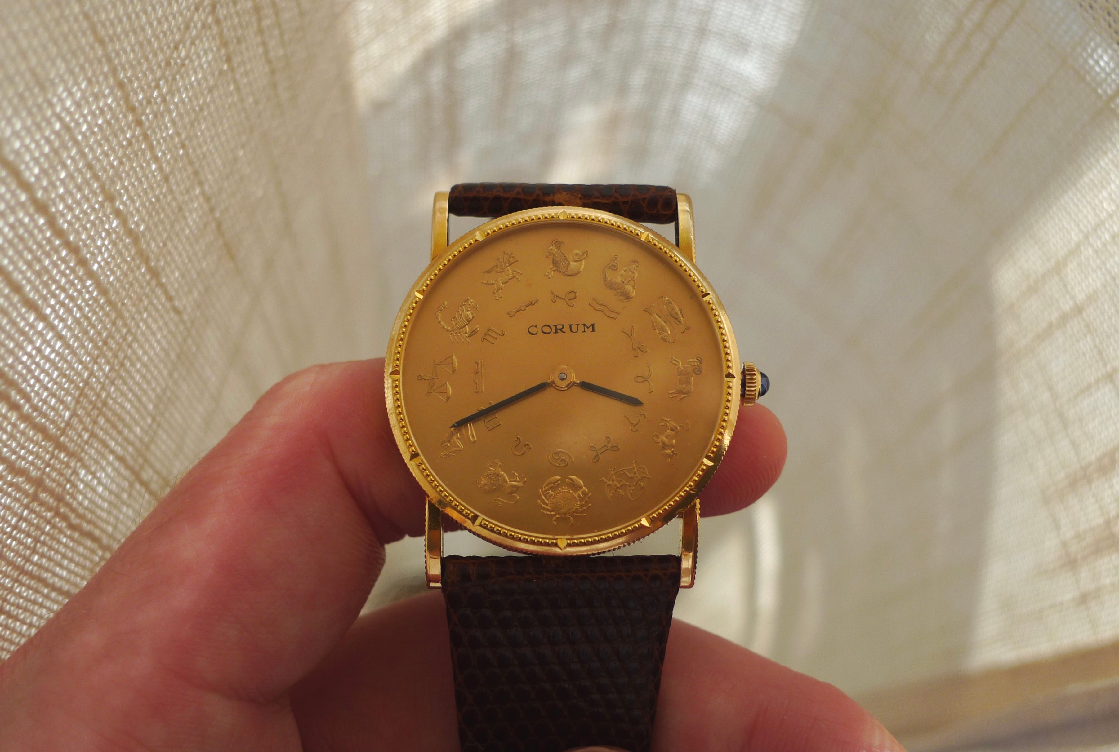
Specifically here, I’m highlighting a watch I was able to be hands on with for a while this spring: the Corum Zodiac in 18k yellow gold. This particular reference is from 1971, so a time when things were acceptably funky, and showed some true ingenuity on the part of whoever thought up this design. Each hour marker is a different Zodiac sign, and while I’m very, very unfamiliar with anything to do with the Zodiac calendar, I did thoroughly enjoy being able to say things like, “it’s almost crab o’clock” or “9 o’clock is Batman’s favorite time of day…why?…because it’s justice time.”
*crickets*
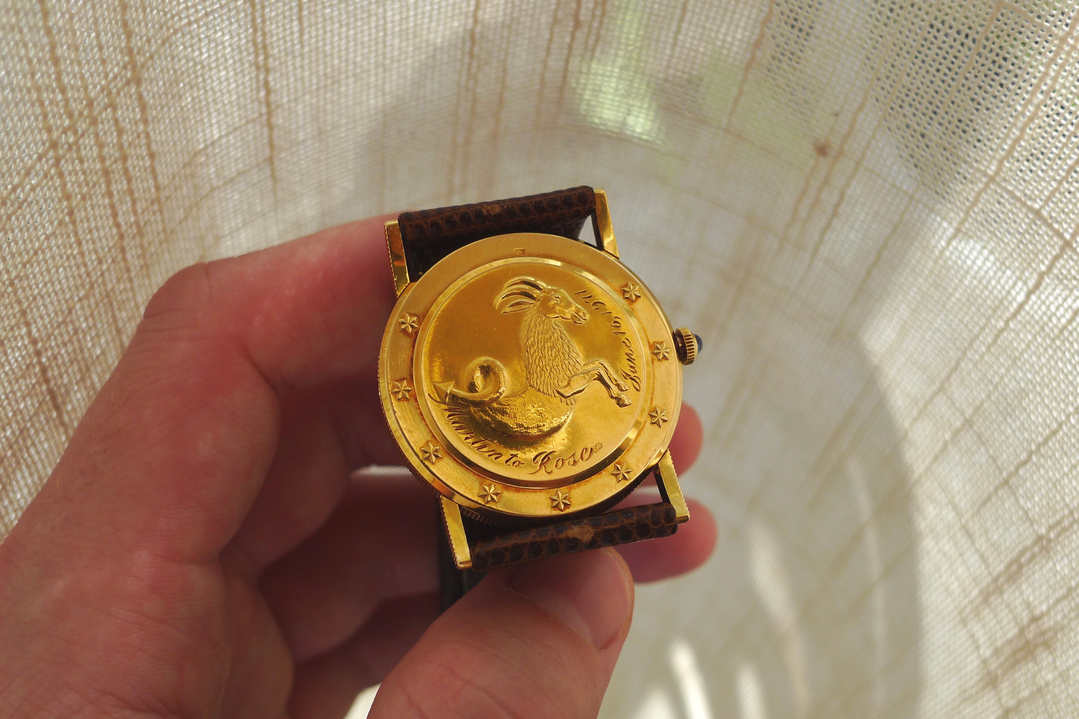
What initially surprised me the most about this watch was the level of detail put into the case and dial. While printed or textured dials are common to see, fully carved and raised indices in solid gold are a totally different level of craftsmanship; same goes for the caseback, which gives off some serious Omega Seamasterness. Gold is a funny material for watches because it’s easy to make a piece look too flashy, or too much like a jewelry brick. This Corum has tons of character and definition, but comes across as oddly subtle, which I think was down to the slim profile, smaller case size (33mm, though wearing much larger thanks to 22mm lugs), and lack of juxtaposed colors on the dial. It feels classy, but in a whimsical sort of way. And just because they could, Corum pulled a Cartier and made the crown a blue sapphire. It’s the only pop of color present besides the black/gold hands/dial contrast, and it’s really nice touch.
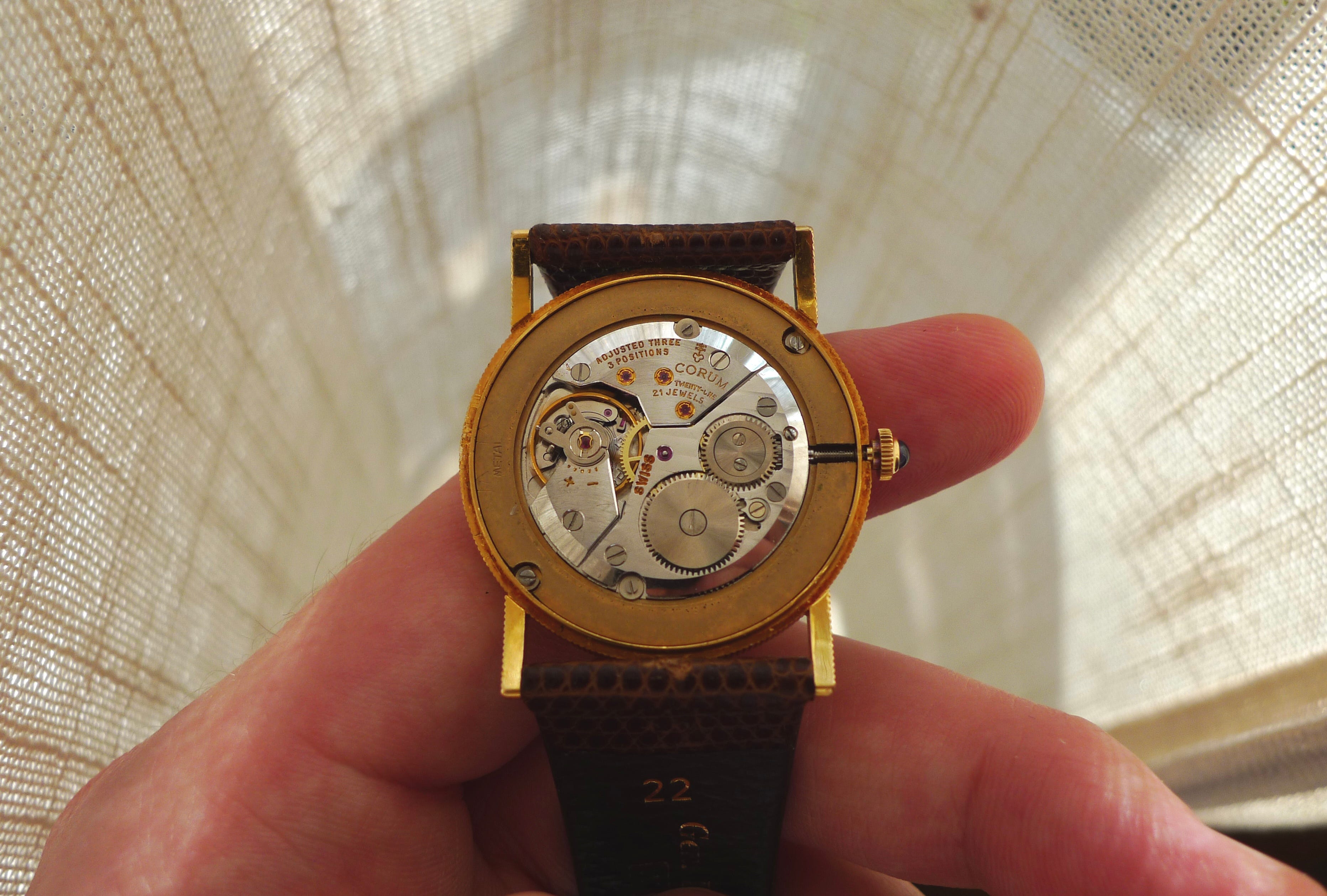
The movement, while not exactly special, is still nice. Movements aren’t exactly why someone would gravitate towards a gold Corum piece, but it’s a bonus point to know that the handwinding mechanism isn’t be something that detracts from the form and function of the watch. I do find it interesting to see how, in contrast to many other vintage watches of the 60s and 70s, the case is deliberately constructed to take up far more space and wrist real estate than the movement would require. It’s common to see old Bulova and Hamilton watches, for example, with movements that almost entirely fill up their respective cases. Not so here! The emphasis is on the artistry and creativity of the case itself; the movement, for better, worse, or somewhere in-between, is not the priority.
Despite being a thin and very flat watch, the indices and markers on the dial having the textures and 3D nature that they do provide an aesthetic that I find to be pretty remarkable. It evokes an artistic sense that’s not too dissimilar to pottery or sculpting, and at the risk of sounding like I’m stretching this analogy a bit too thin, like something you’d find in a museum from ancient Rome or Greece.
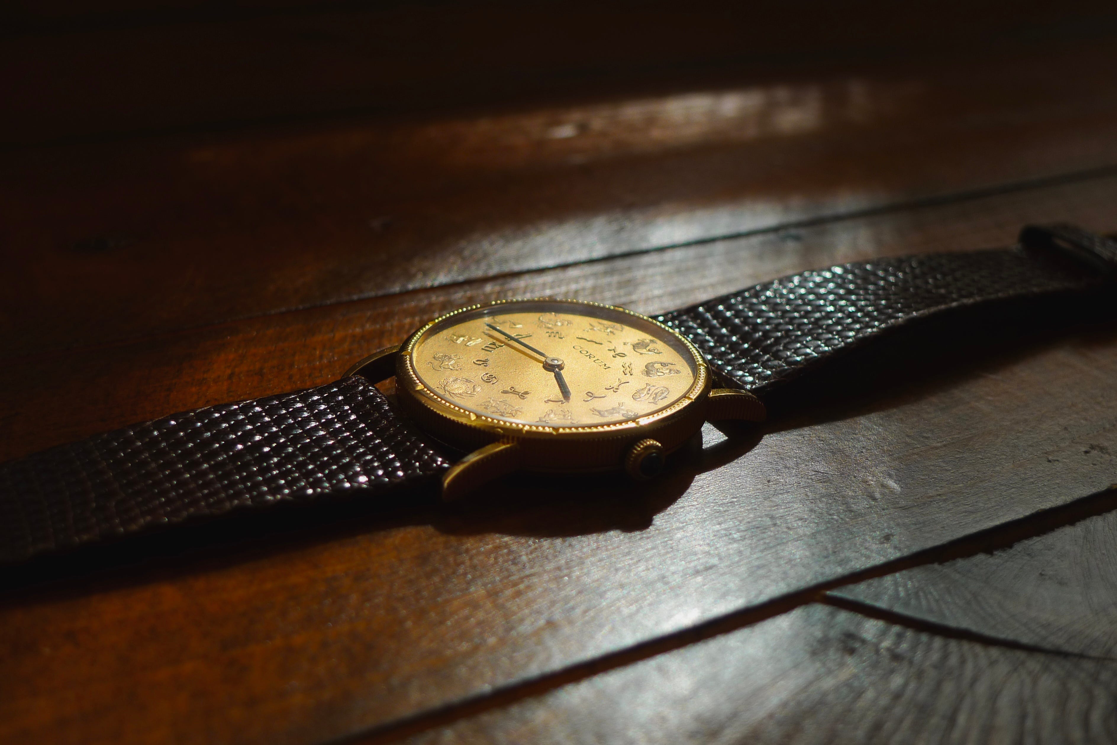
While not exactly the most legible at night - obviously Corum didn’t think we’d be taking this out hiking towards a sunrise - I did find that this watch was an easier glance-timer than I expected it to be. It’s more of a, “it’s about 4:15” than a “it’s 4:16 and 22 seconds” type of watch, but that’s part of this somewhat luxurious, quirky charm.
Gold watches are a bit of a statement, and somewhat confounding gold pieces are another still, but if you’re looking for something different that’s still flying in relative horological obscurity, I would recommending checking around for something in the realm of vintage Corum gold. Pricing is, quite literally, all over the place, ranging from a few hundred dollars for some of the quartz gold pieces to several thousand for the manual winding ones. What this tells me is that the market, and the watch selling/buying populations on the whole, don’t quite know what to do with or how to appropriately value these watches. Which, to me, is an excellent indicator that we’ve stumbled onto something good.
To test this theory - briefly - I reached out to ten different watch dealers about Corum watches and whether they deal with/purchase/sell them (specifically of this type and era). Some were the larger dealers that you likely get emails from or have seen ads from, and others were smaller dealers who either held AD status or mostly purveyed the grey market. Six of the dealers said that they don’t delve into vintage Corum, two said that they try to buy them incredibly low (and then sell as 7-8x the purchase price), and two did not respond. Technically, this is a form of qualitative, scientific research, and the results show that Corum is currently a big ol’ question mark in the eyes of dealers.
Again, I love this, because it shows that if you’re in the market for something like this piece, you’re likely going to a) have a tougher time finding what you want, but b) have a much more rewarding search and acquisition process.
Corum may never have its moment, and that’s okay, too; not all watches need to find mainstream popularity to be appreciated. But I think that people are missing out if they’re not at least taking a passing gander at the world of vintage Corum gold.
As always, wherever you are, and wherever you’re going, many thanks for stopping by.