


Credor Pacifique: "Japanese Nautilus"
undersung, undervalued, under-the-cuff

Happy New Year everyone!
Kicking off my writing for 2023, I’m excited to be able to show you all something that, I think, will be entering your sphere as a bit of a rarity. After a bit of time on the hunt for a quality example, I was fortunate to find (and pounce on, of course…#huntingpuns) a 1996 Credor Pacifique. This is a watch that you’ll likely never see out in the wild, especially outside of Japan, and it took finding a dealer in Japan to get this watch stateside.
I’ve long been a huge fan of Seiko, from vintage to modern, dive to dress, and just about everything in-between. The SKX007, 45KS, and several vintage references with faceted crystals have featured in my writing before, and my collecting has taken me all over the place through Seiko’s various lines (Lord Marvel, Lord Matic, King Seiko, Grand Seiko, etc.). Credor, however, was always missing, largely due to their modern offerings being, though incredible beyond words, limited and often tens of thousands of dollars, and their vintage lines being seemingly 95% quartz (not my specialty). In the 70s, 80s, and parts of the 90s, quartz was where Credor made their biggest mark. At the time, especially in the 70s/80s, quartz was a big deal. It was the latest technology, accuracy personified, and due to quartz movements typically being very, very thin, the new avenues for dress watches were pursued by just about every watch company. Rolex had the Oysterquartz, Patek Phillipe produced various references of the Nautilus in quartz, AP made quartz Royal Oaks, and this all stemmed from Seiko’s mainstreaming innovation and production (‘twas the quartz crisis after all). Credor, as a sort-of boomerang operation, was Seiko’s answer to the Swiss brands’ upping of the quartz game. While most vintage Seiko lines leaned heavily on heritage design language and aesthetic principles, Credor focused on small batch, top shelf models, pushing quartz into an arena of oooo, fancy. The watches were meant to be elegant, often flashy, and almost always including the use of precious metals, keeping in line with the broader thought umbrella that Seiko held in its higher-end lines that even simple things could be done to a very high standard. Credor was the part of Seiko where semi-intrusive thoughts of, “could this too be luxury?” not only made it onto the storyboards, but onto the watchmakers’ benches, and eventually onto the wrists of consumers. The intent was never for these watches to be a worldwide phenomenon, but rather a distant layer of intrigue; few people outside of Japan knew of Credor’s existence, partially due to a complete lack of international marketing. Even all these years later, it’s really only within the watch nerd community (and more specifically, those who are focused more on Japanese/JDM watches) that the name is somewhat recognizable.
If you’re looking for a vintage or neo-vintage Credor watch that’s quartz, you’ll be surprisingly spoiled for choice under the $1,000, $500, even $300 mark. Again, quartz was kind of their thing, and it’s incredible to see how identifiable some of these watches are for their decade of production; have a look at some of these vintage ads to see what I mean: https://www.plus9time.com/blog/2018/10/22/credor-brand-introduction-and-history
My problem: I wanted a mechanical Credor, with a similar thinness to the quartz models, specific design cues that screamed out its decade of production, and the attention to detail that I’d heard (and read) so much about when it came to the Credor name. The quartz references seemed to be everywhere, but those with automatic/manual wind movements, less so (within any type of reasonable price point). That’s when I found an expired listing for a Pacifique on an old forum about a year ago - at a similar price to its quartz counterparts - and was on the lookout immediately after discovering it.
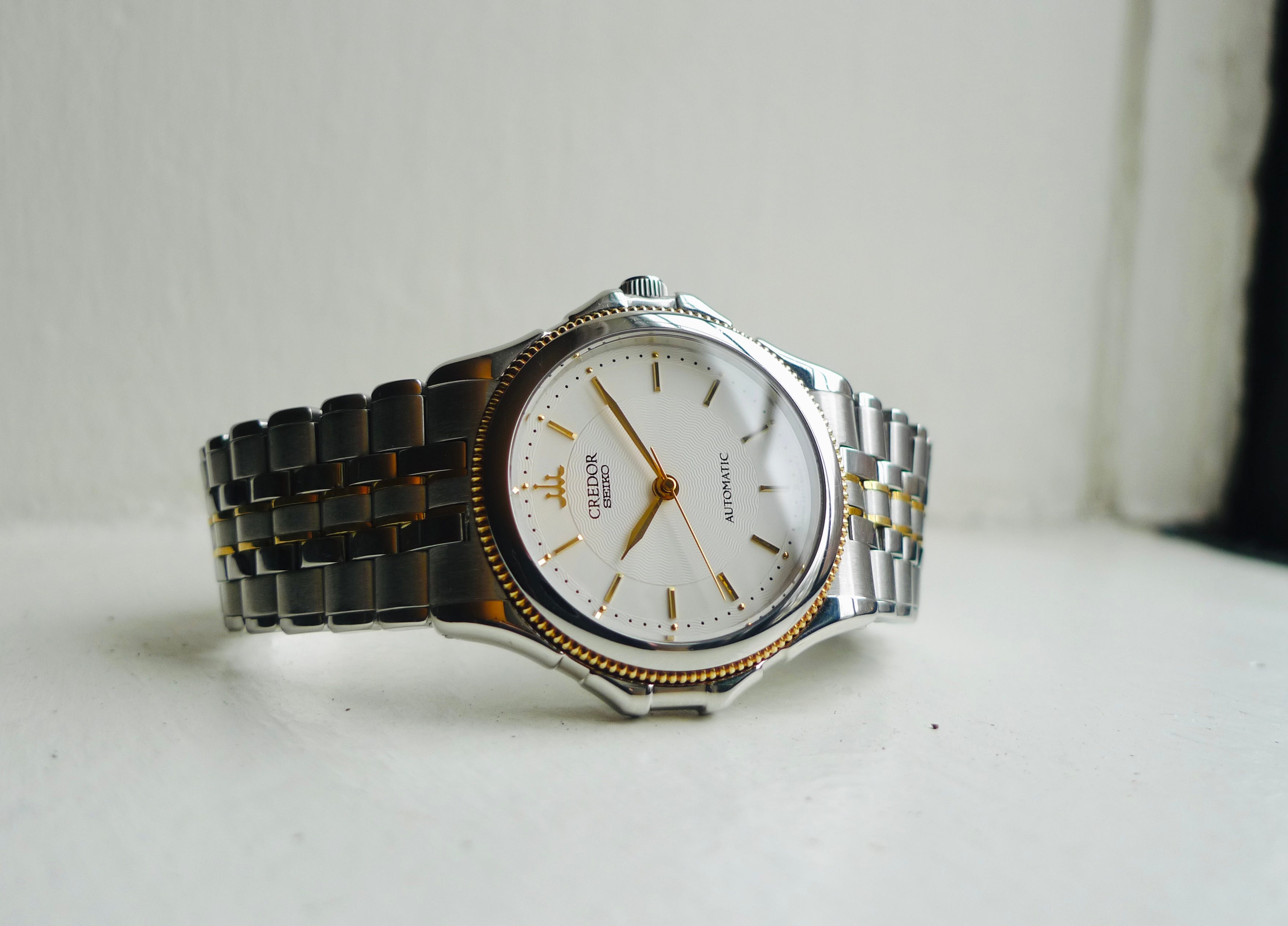
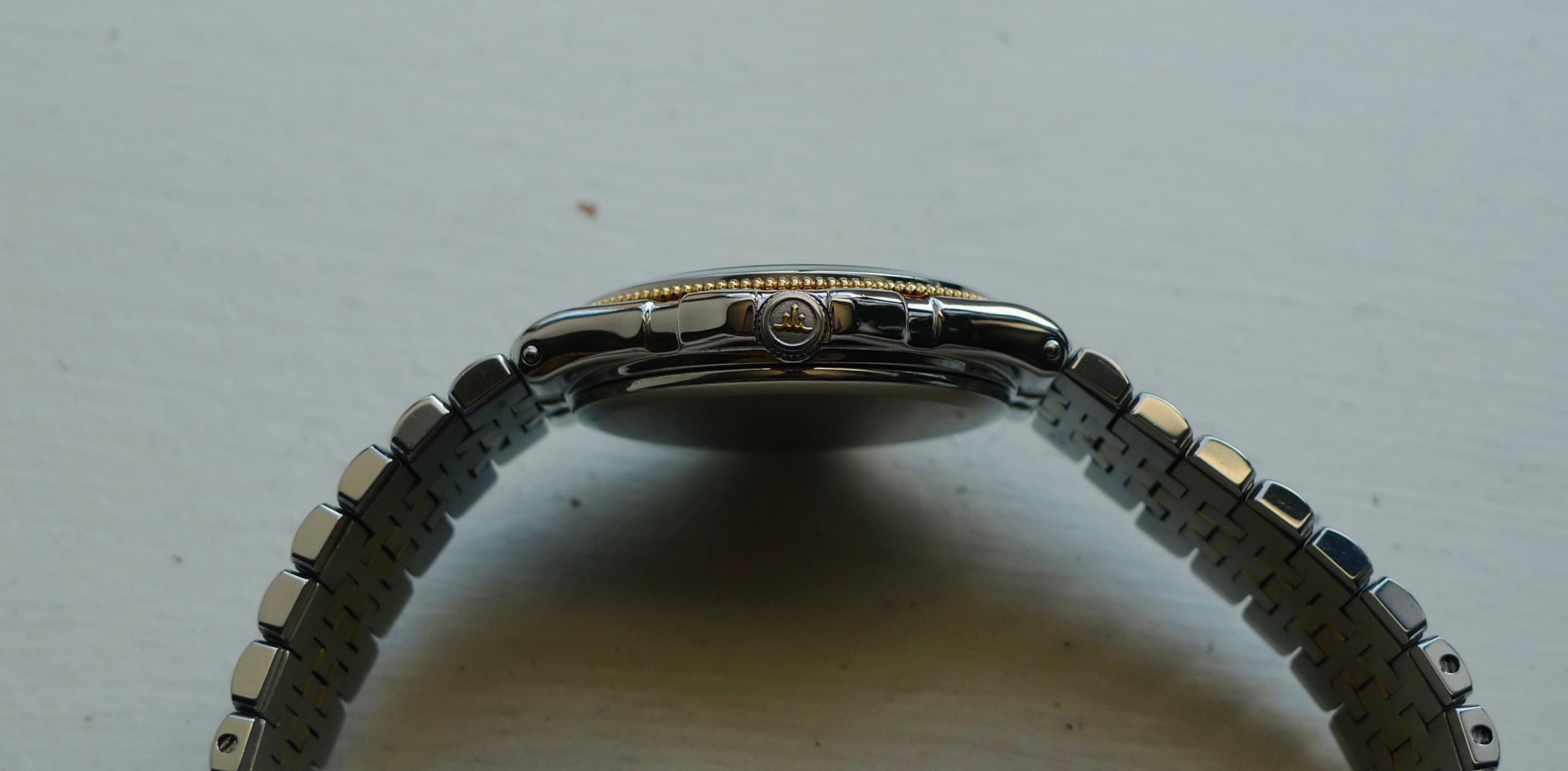
When I saw it, I jumped at the chance to have it. The coin edge bezel, as well as the indices, hands, center links, crown logo, and clasp text, are all in 18k gold. As a two-tone, steel and gold watch, it screams “hey I’m from the 90s.” Which I am, so it felt like an appropriate fit. I’d also never owned a watch with an integrated bracelet before, so that was a nice bonus, and the ears on the case garnered it the nickname “Japanese Nautilus” from a few folks after seeing it. Quick side note: Credor did actually have a watch designed by Gérald Genta back in late 70s, the “Locomotive,” and it’s pretty apparent that this collaboration had a trickle-on effect on the design language of some future Credor references. Hence, potentially, some of that Patek Nautilusness we see here. Back to the watch: at 34mm in diameter and only 9.3mm - I repeat, NINE POINT THREE MILLIMETERS - thin, it sits so comfortably on the wrist. The unreal thinness is down to the Seiko 4S71-6A00 movement, a high-end, 25 jewel movement designed specifically for this limited line of Credor Pacifiques (1995-2003).
When it comes to the dial, from a distance, it’s another watch with a white dial. Up close, it’s a multidimensional work of art.
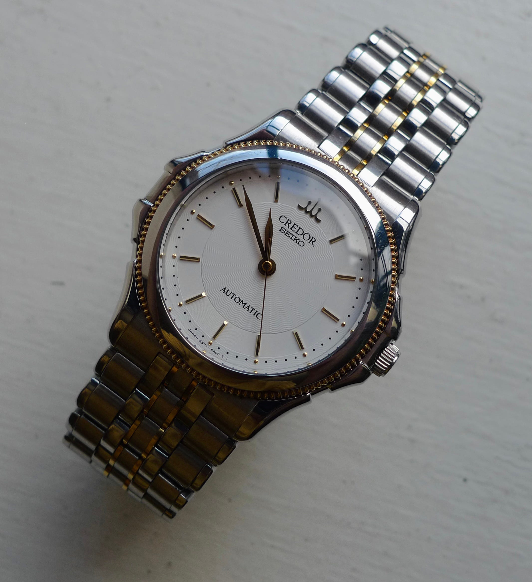
Beyond the indices and gold pips (no lume here), the texturing of the dial is so satisfying. Waves moving outwards from the center give a nautical ethos, which is on brand for me. The Pacifique line was created to give a more oceanic feel, drawing inspiration from sailboats and beachfront visage; the bezel even bears similarities to the textures of an old rope coil. Notice as well how around the indices, the wave texture breaks in favor of a smooth ring. This is a brilliant piece of design in my eyes, allowing the sharp indices to stand out just a little bit more than they would over the wave dial and picking up the waves once more around the dial’s outermost area. It’s a small detail, but it punctuates the rest of the dial.
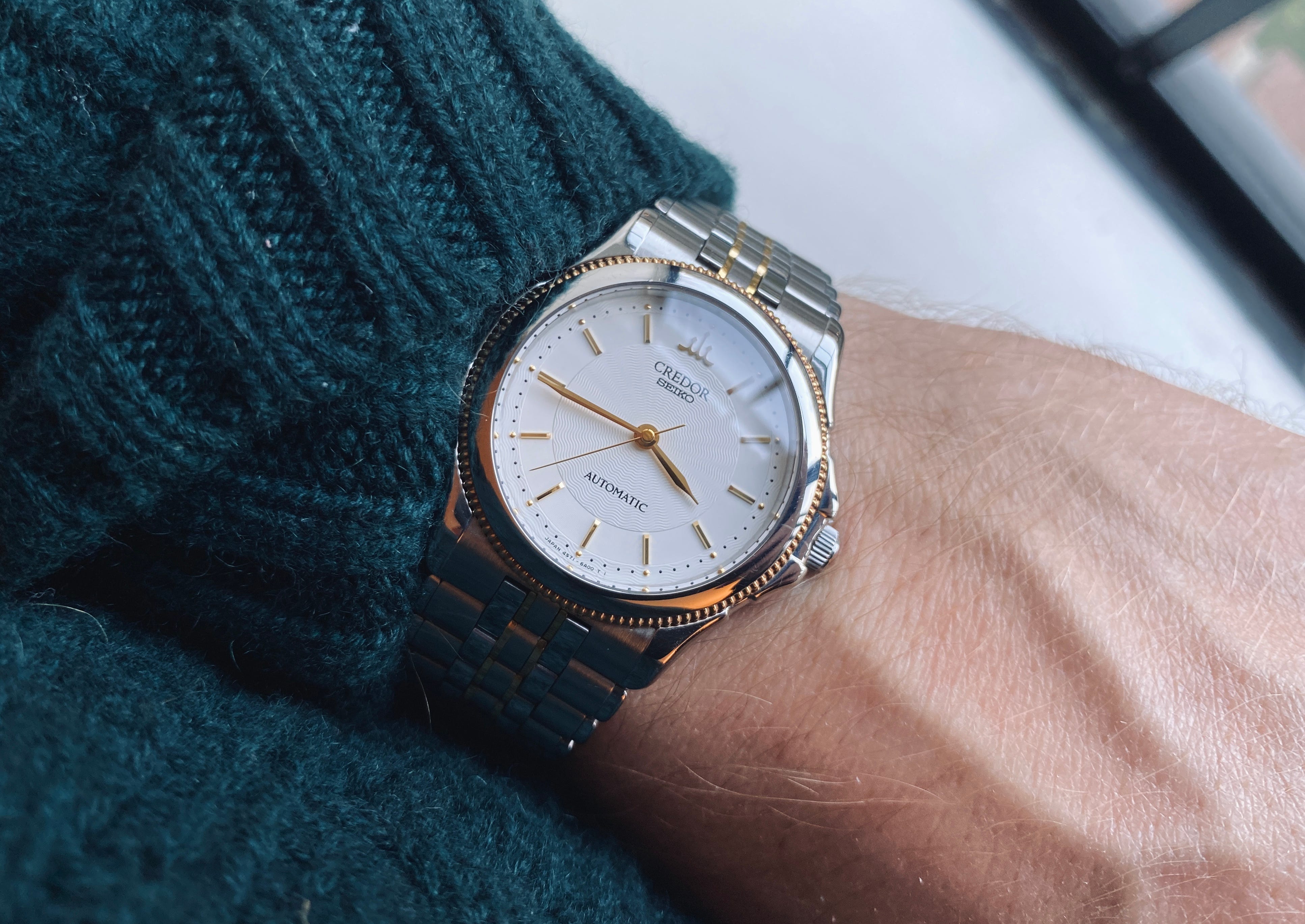
Another small detail that I love: double-signed Credor/Seiko. Similar to older Grand Seiko references having both Seiko and Grand Seiko on the dial, Credor watches would have the Seiko name co-branded on the dials, being a part of the greater Seiko empire. Nowadays, you’ll only see Credor on the dial, similar to how you’ll only see Grand Seiko. I enjoy having a reference that’s double-signed because it represents a very specific time in the history of the brand (these are the little things that bring me joy).

Moving away from the dial, the bracelet is another piece of wonderful design. It’s an example of subtle two-tone done right; just enough to be noticed, but not obnoxious, The feel of the bracelet is one of the most comfortable I’ve ever worn, and it hugs my wrist lightly but securely.

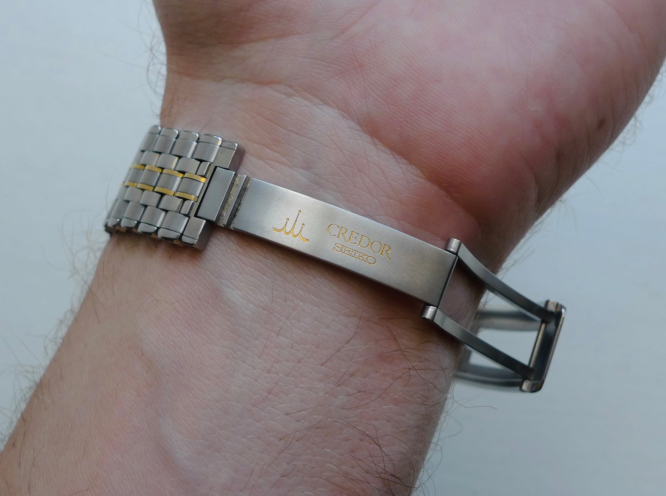
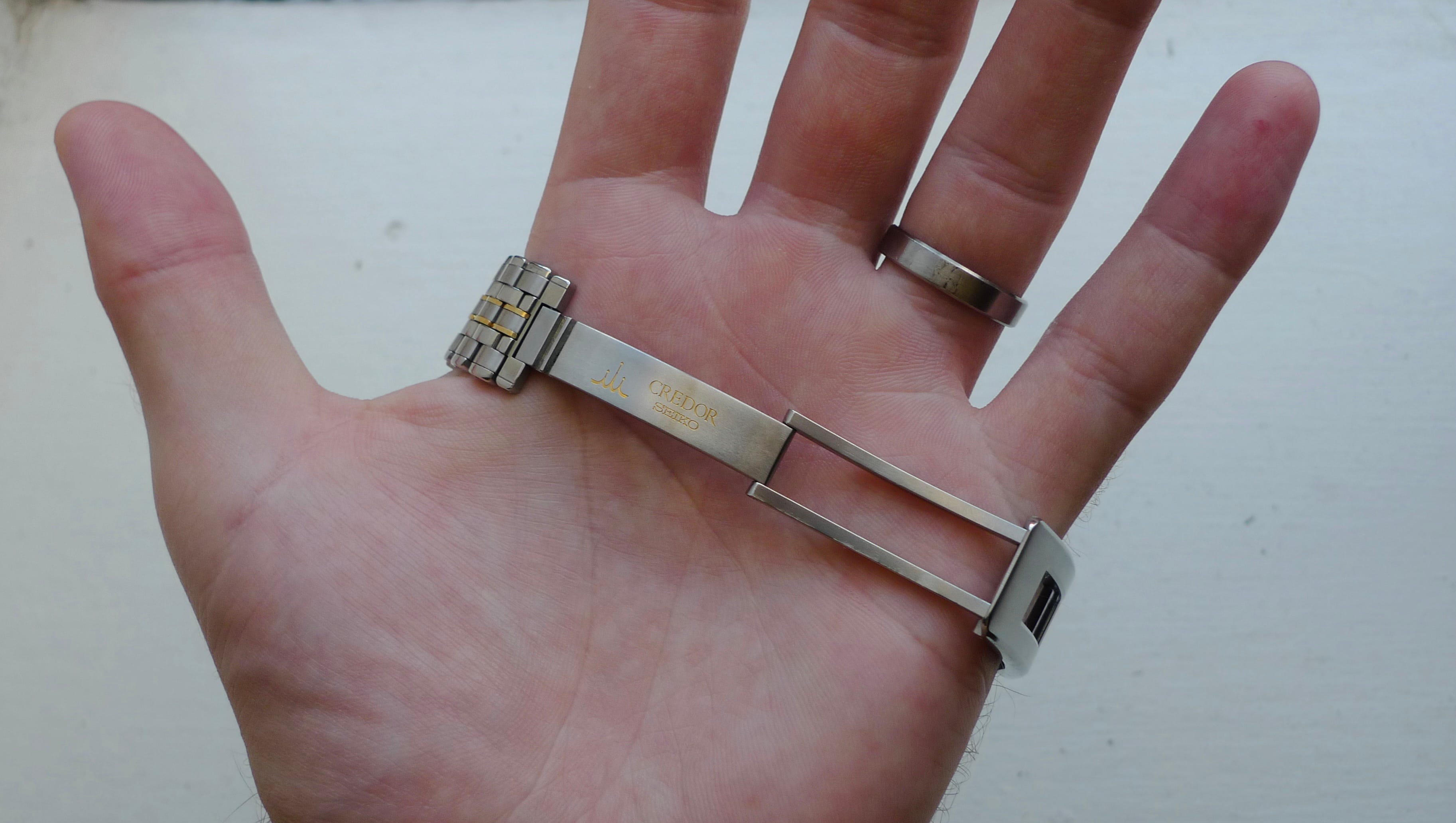
An obvious point of contention here will be that a clasp/bracelet combination like this one will not fit every wrist out there. No microadjust capabilities, and taking out/adding in links is an absolute bear, but if you’re someone with a wrist in the 6-7.5 inch spread, you’re unlikely to fall between link sizes given how they interlock. I tried distributing the links in a few different configurations to see how the fit would correspond (equal on each side, one additional link set on the 12 side, one on the 6, etc.), and I found that, pleasantly, the clasp functions as a sort of “great regulator,” balancing the watch from the underside of the wrist as opposed to the top. This is only possible because of how thin and compact the watch is - couldn’t be top-heavy if it tried - and further reinforces the intentionality of each aspect of this watch’s design.
This watch is an absurd value; vintage Credor in general presents great value, quartz and mechanical both. And by value, I don’t mean buy-it-and-flip-it, hype watch value. I mean bang-for-your-buck value, you-know-it-you-love-it value, true enthusiasm value. As the usual suspects and brands continue to increase retail prices, and as the secondary market, though steadily falling, still places so many great watches out of reach, you certainly won’t do yourself a disservice by taking a dive into the world of vintage and neo-vintage Credor. You might just discover your next watch obsession.
As always, wherever you are, and wherever you’re going, many thanks for stopping by.